Entries in design (6)

Tuesday
Dec012020

Beer and Coffee

It's a pleasure to work with certain clients and produce tasty work. By that, I mean something that looks as good as it tastes. Our senses are tied to pleasure centres in our brains, so putting a visual statement on a package can satisfy both the palate and the palette.

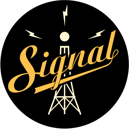
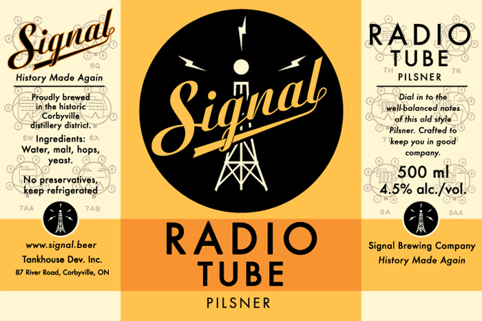
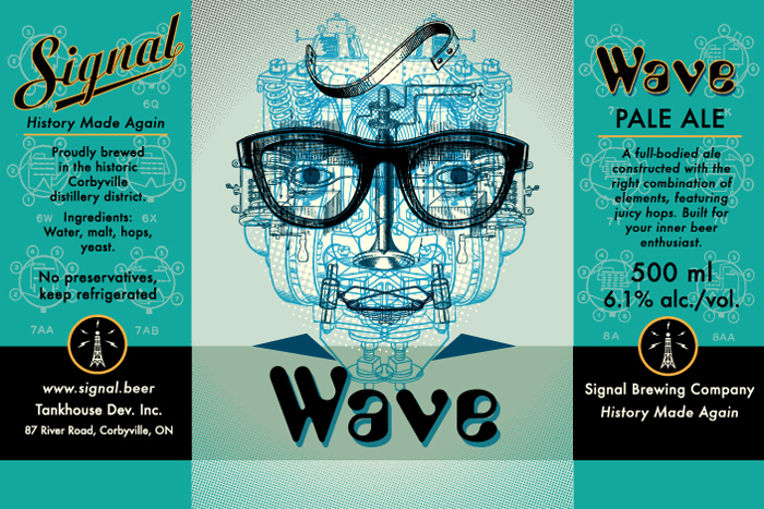
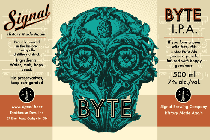
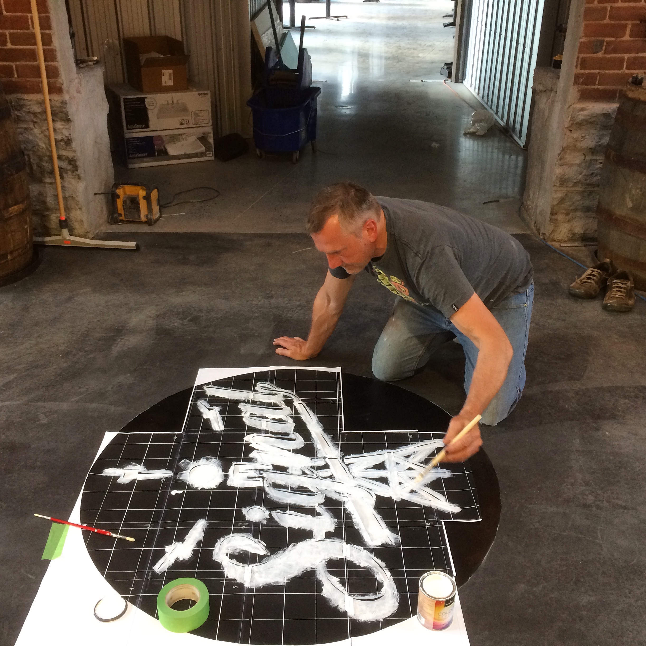
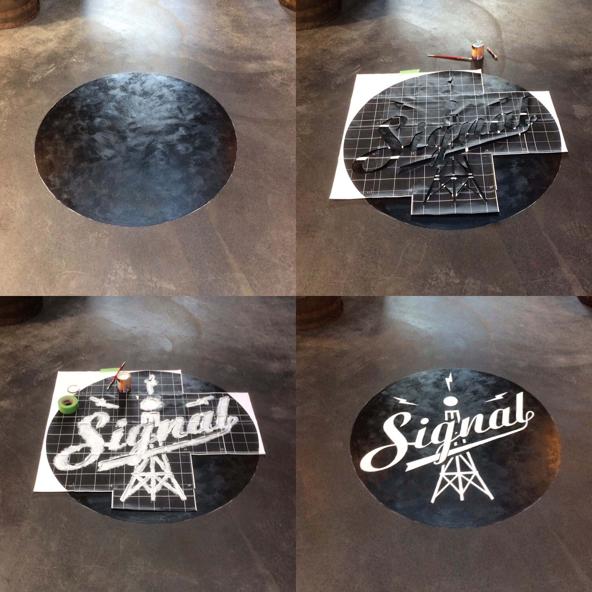
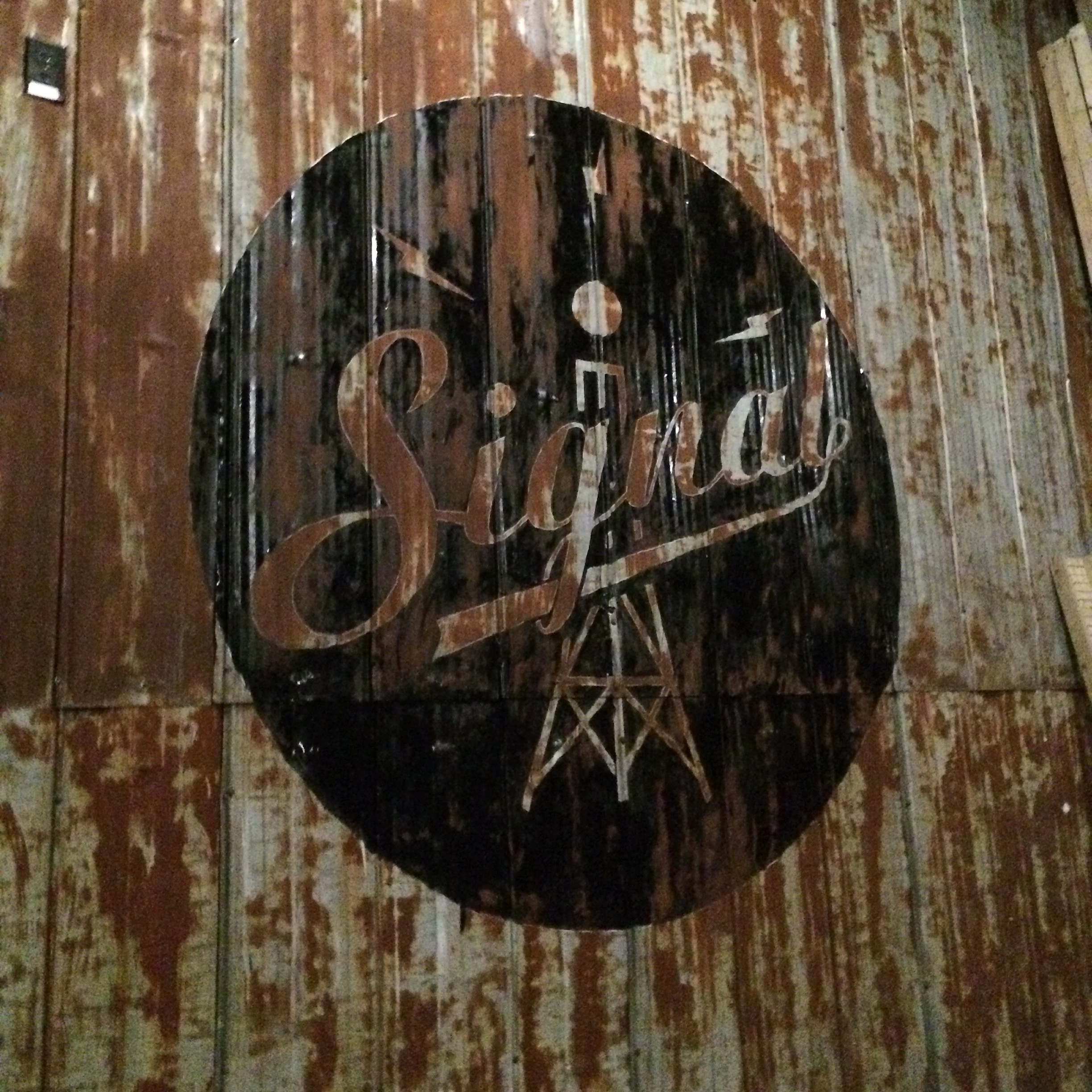
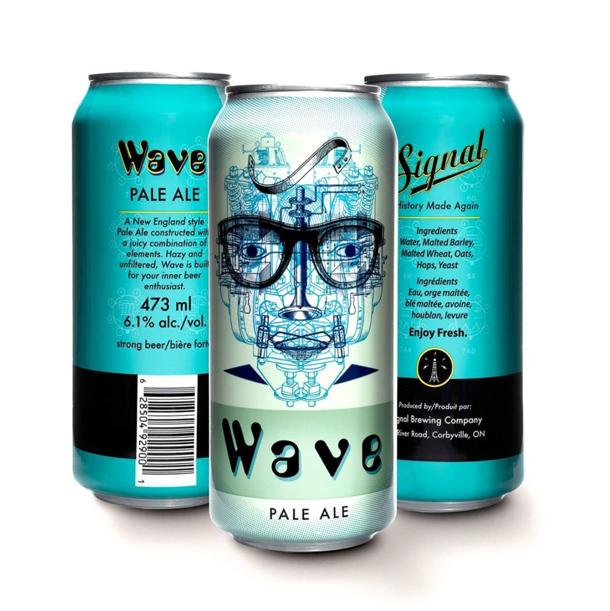
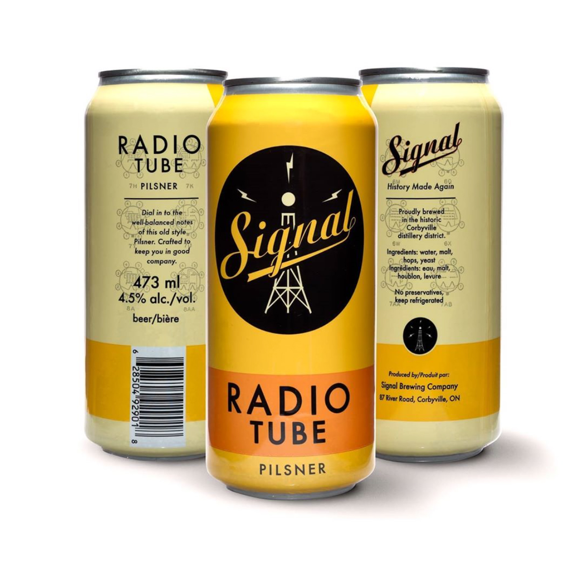
Here are some recent projects, one with a local brewery, the second with a local coffee roaster. Both are exceptionally delicious, high quality and I'm excited to be a part of their identity. I posted earlier designs from Signal, when I developed their branding and identity. The images here show the cans produced for the LCBO (distributed throughout the Province of Ontario).

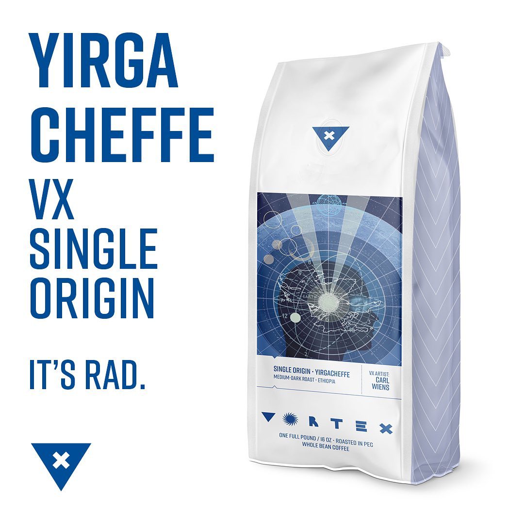
Now for the eye-opening goodness of dark roast coffee, an absolute essential in my home. Ryan Noth kicked off the project, working with Cherry Bomb Roasters and fellow illustrator Clayton Hanmer, who coordinated the design. Kyle Topping and Chrissie Poitras, good friends from Spark Box Studio also contributed artwork for the other blends. Nothing like a kickass collaboration!

Here's a detailed view of the artwork:

Wednesday
Jul262017

Signal Brewing Company

Corbyville sits on the Moira river north of Belleville. Corbyville was once a thriving centre of industry, it produced whiskey and spirits for over 100 years. Sadly, the plant closed in the 1990's and most of the complex was destroyed by fire.

In several buildings that remain on the site, there has been a rebirth of sorts. Richard Courneyea purchase the old excise building and pumphouse, close to the river and has spent the better part of a year building a brewery on the site. I worked with Richard and his team on the concept, identity and branding. Signal Brewery opened it's doors this week.

It's a challenge to find the right image for a brewery, with so much history and craftsmanship to take into account, so I worked with Richard to refine the image, to find the right balance. We went through multiple iterations and designs until we came up with a simple, strong central image.

The site is beautiful, and the beer is also excellent. So thrilled to see all of the hard work pay off, and to have been a part of this from the start.

The brewery is developing a full range of craft beers, so we worked together to pair my illustrations and type with different brewing styles. Here is a sampling of three new labels. More brands and labels will be released down the road.


Easy drinking pilsner, anchor brand:


Full bodied (and very juicy) pale ale:


Hoppy and intoxicating:


I was inspired by Richard's dedication and work ethic to provide some of the finishing touches on site. I have a few pictures of the medallion I painted on the floor and the tasting room in the brewery, using a hand-cut stencil.


The event room has a stage space backed by reclaimed, rusted barn siding. I projected the image on to the wall and worked the rusty parts into the sign, to give it a weathered look. It's great to work big!


The motto of Signal is 'History Made Again'. Looking forward to many years with tasty beers for Belleville!

Follow/like Signal Beer on Facebook:

Signal Beer

Better yet, drop by the brewery, pick up a t-shirt and sample some pints. Signal's website will be up soon.

 Here's an amazing aerial shot of the site:

Wednesday
Jul052017

5 Days in July

Blue Rodeo is an iconic Canadian band that has established itself as part of the musical landscape. I was contacted by Polaris - the Slaight Family Heritage Prize and commissioned to create a poster for the album 'Five Days in July'. Since it's the fifth of July, I thought it would be a good time to talk a bit about the project and show the artwork.

The album was recorded at Greg Keelor's farm in rural Southeastern Ontario, not far from where I live way back in 2008. The countryside is rolling, with farms and trees and rivers. There is a strength and integrity in the music, as most of it was recorded in one take from the floor. I wanted to capture that feeling, and the title of the album in the image. I used to walk to a spot in the fields behind our old house and there was a beautiful tree standing alone. I was always drawn to that spot and it was the inspiration for this image.

Silkscreen poster - 18" x 24", 4 colour printed by Kid Icarus. I chose sunny summer colours to capture the feeling of a hot hazy July day.

The Heritage Prize selected eight classic Canadian albums and awarded prizes for this year's event. Each of the posters is limited to an edition of 49. You can order a print online here. I worked with designer Vanda Marasan, and was super excited to be included in this event. Here's a shot of Jim Cuddy accepting the award, the band loved the image.


You can read a more in-depth article on all of the posters and comments by the artists in this article on Passport 2017: Walls of Sound - Eight new posters by eight Canadian artists, made for the Slaight Family Polaris Heritage Prize, celebrate the best of Canadian music’s past


Saturday
Jan032015

Auld Acquaintance

To ring in the New Year, here's a few fond memories. I discovered these mementos while moving my studio this past year. I have always wanted to document the labels designed for Hillier Wines and Glenora Springs Brewery. These companies were pioneers in the incredible success and development of Prince Edward County, now a trendy tourist destination and home to a thriving wine-producing region.

Work like this is about the people you deal with, the relationships you develop, and the passion and interest that underlies the product. Dan Taylor commissioned the Hillier Label designs, his efforts focused on Pinot Noir varietals. Prince Edward County has long been a productive farming area, and was a long-time producer of canned fruits and vegetables. We worked together to create a visual tribute, reflecting the design qualities of vintage canning labels.

My friend Ruth Gangbar put me in touch with Christopher Gentile, who photographed the bottles. He has a masterful eye and did an amazing job with these.

I also worked with John McKinney at Glenora Springs Brewery. His feature product was Triple Chin, a rich, dark, full bodied ale with a light finish. I play hockey on Mondays with a group of players John put together over the years. Here's to hockey and a good pint!

Sad to say both of these companies have changed hands and the bottles are a relic of the past. But we can raise a glass to those who have paved the way and made the sacrifices. In days of Auld Lang Syne.


Saturday
Apr202013

The Dead Words Project

I spotted this collection online last month and jumped right in. Karen To has gathered a list of antiquated words and combined them with designers who give their own spin on the topic. I like to dig around old manuscripts and encyclopedias to discover obscure references and outdated research, so I found this project appealling on so many levels.

Here's my contribution:

Mecography (mi-kop-gruh-fee) n.1603-1890,measurement of the dimensions and weight of body part.

Ex.The condom company used mecography to obtain necessary data about its clientele.
 
It's an excellent word, isn't it? How could we let it fall through the cracks? Couldn't you imagine an urgent call going out the the mecographer in one of those gruesome forensic prime time shows? Or perhaps in a sporting environment, consulting with bodybuilders or fitness gurus? " My mecographer recommends...."
 
If you love words, and great design, head over to The Dead Words Project for more.